Resizing images on small screens is one of the most important benefits of using media queries, especially in email. Since one of the most common trigger sizes for media queries in email is 480px (the width of most phones in landscape orientation), images wider than 480px will result in some horizontal scrolling, which should generally be avoided.
However, making the image responsive (i.e., flexible) will solve this problem. Let’s look at the most popular method for making images responsive when designing email templates.
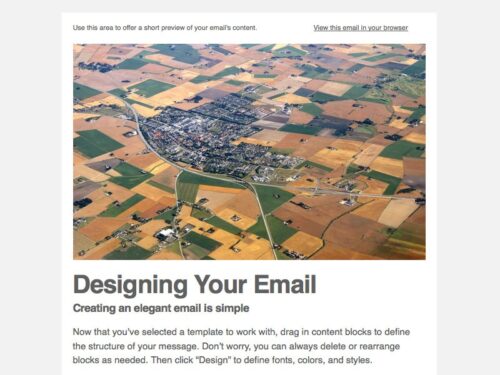
Because the image is responsive, it can also adapt to different media query trigger sizes. Here’s our example image and the code behind it:
<img src="" alt="" height="" width="" class="emailImage" />A fairly simple option. Now let’s move on to the CSS media query:
<style type="text/css">
    @media only screen and (max-width: 480px){
        .emailImage{
            height:auto !important;
            max-width:600px !important;
            width: 100% !important;
        }
    }
</style>
When the email is viewed on a screen with a resolution of 480px or less, the image’s height and width are redefined, and a maximum width is set so the image doesn’t look cluttered.
As a rule, the maximum width should be equal to the image’s original width. As a result, once the media query is triggered, we get an image that fits on a small display:
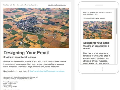
The image is responsive, so it fills the available space regardless of the screen orientation—portrait or landscape—and readers do not have to scroll horizontally.
